... and student, typography enthusiast, and prolific experimenter currently studying Graphic Design (BA) at ArtEZ Arnhem. You can also find me on Instagram. Any inquiries, commissions, or collaboration ideas? Send me an e-mail: jonasriemersma@gmail.com.
Recently:
Fotoarchief Stenen Tafel / 2024 —
How to Disappear Without a
Trace at De
Meldkamer, Maastricht / 3 — 26 November 2023
marathon01 at Lorem
Ipsum, Amsterdam / 16 December 2023
Regularly organising FiveThirtyTypeClub
workshops / 2023 —
Graphic designer, student, typography enthusiast, and prolific experimenter currently studying Graphic Design (BA) at ArtEZ Arnhem. You can also find me on Instagram. Any inquiries, commissions, or collaboration ideas? Send me an e-mail: jonasriemersma@gmail.com.
Recently
Fotoarchief Stenen Tafel / 2024 —
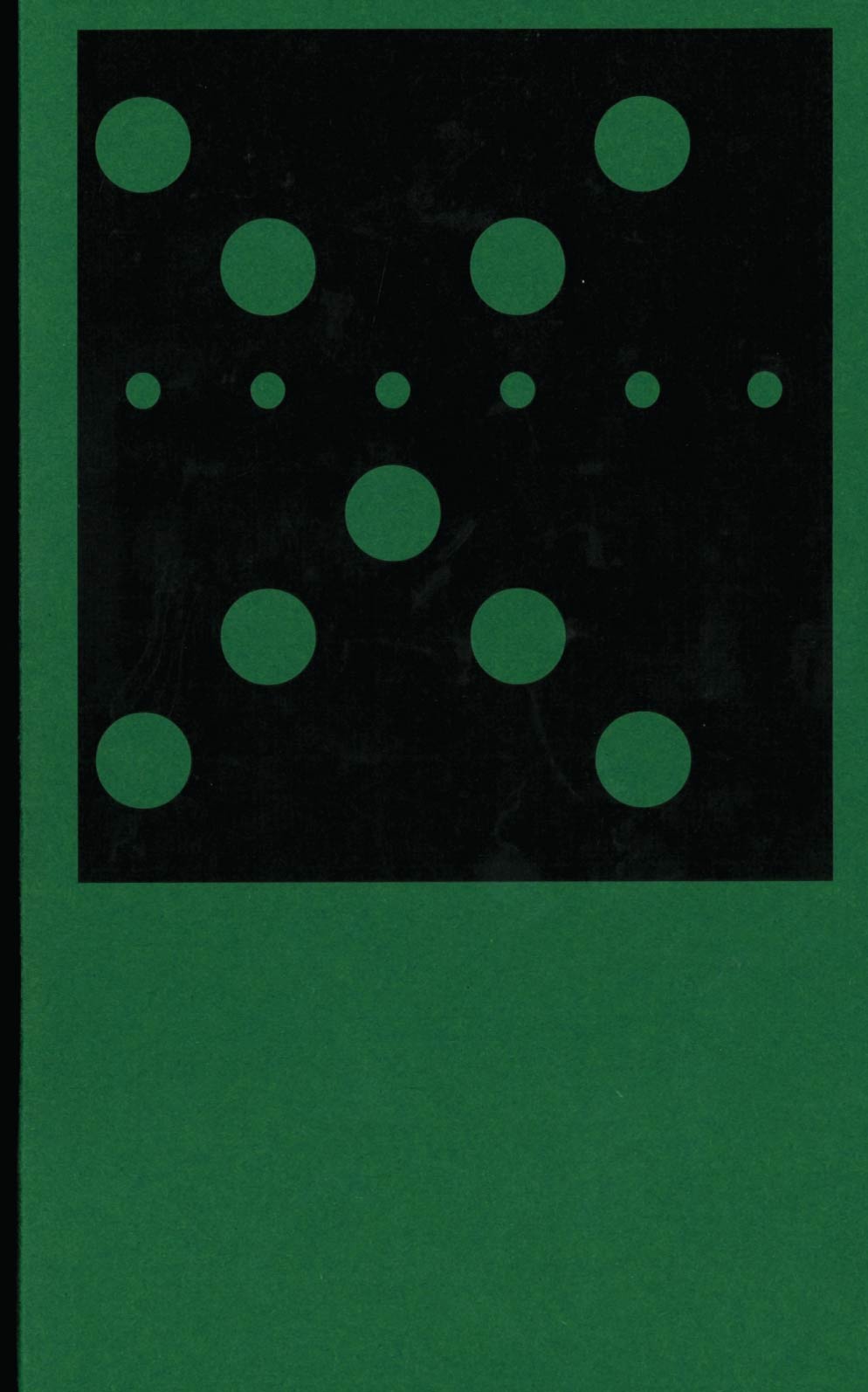
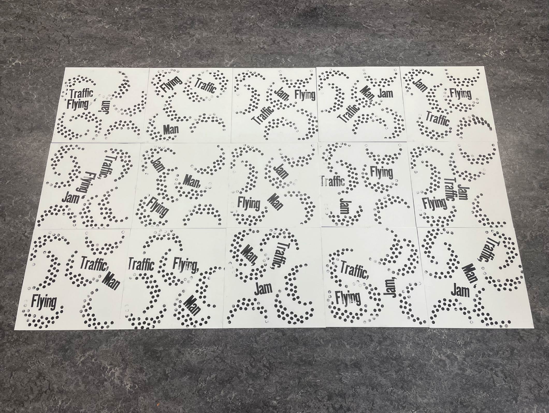
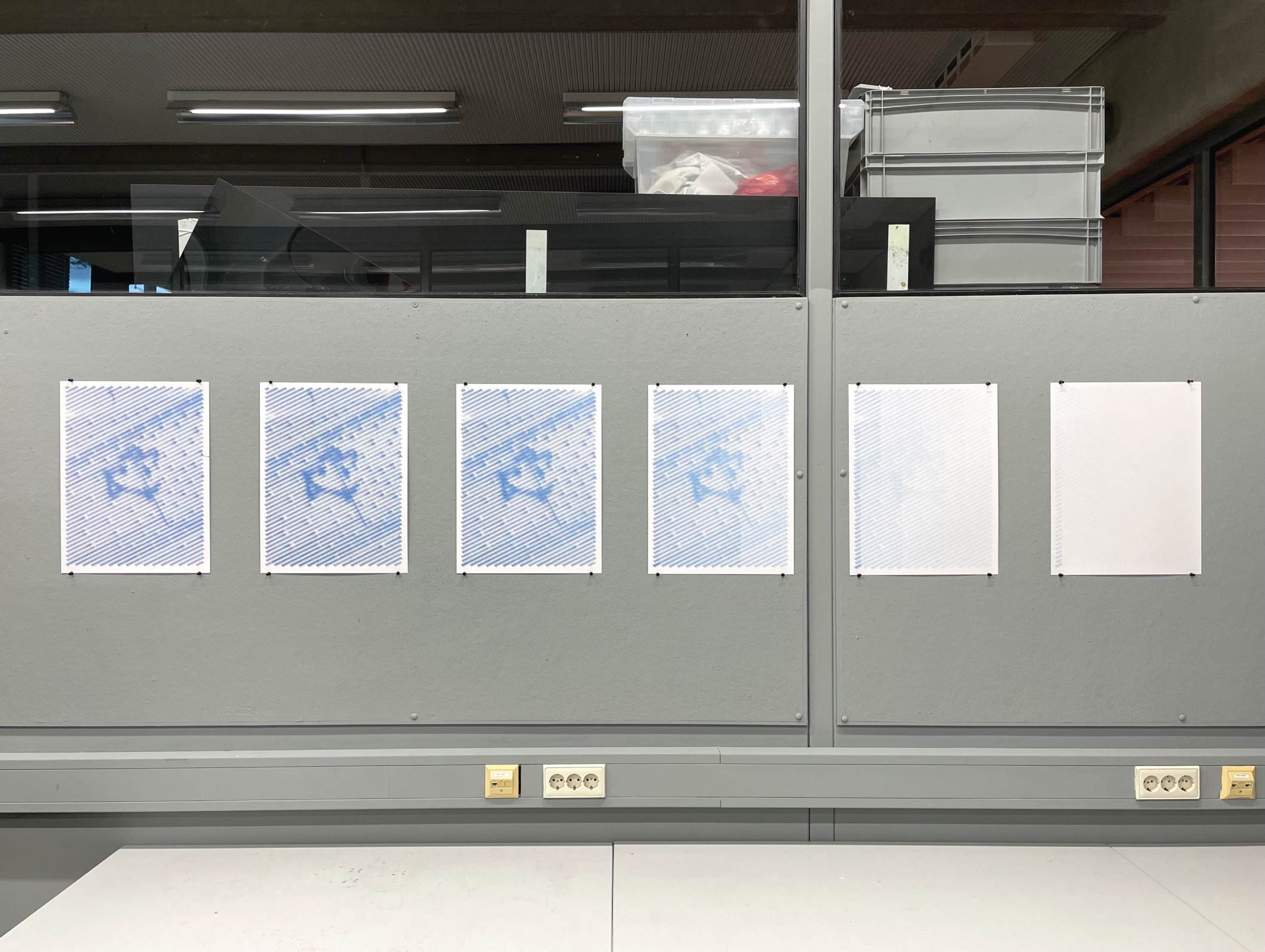
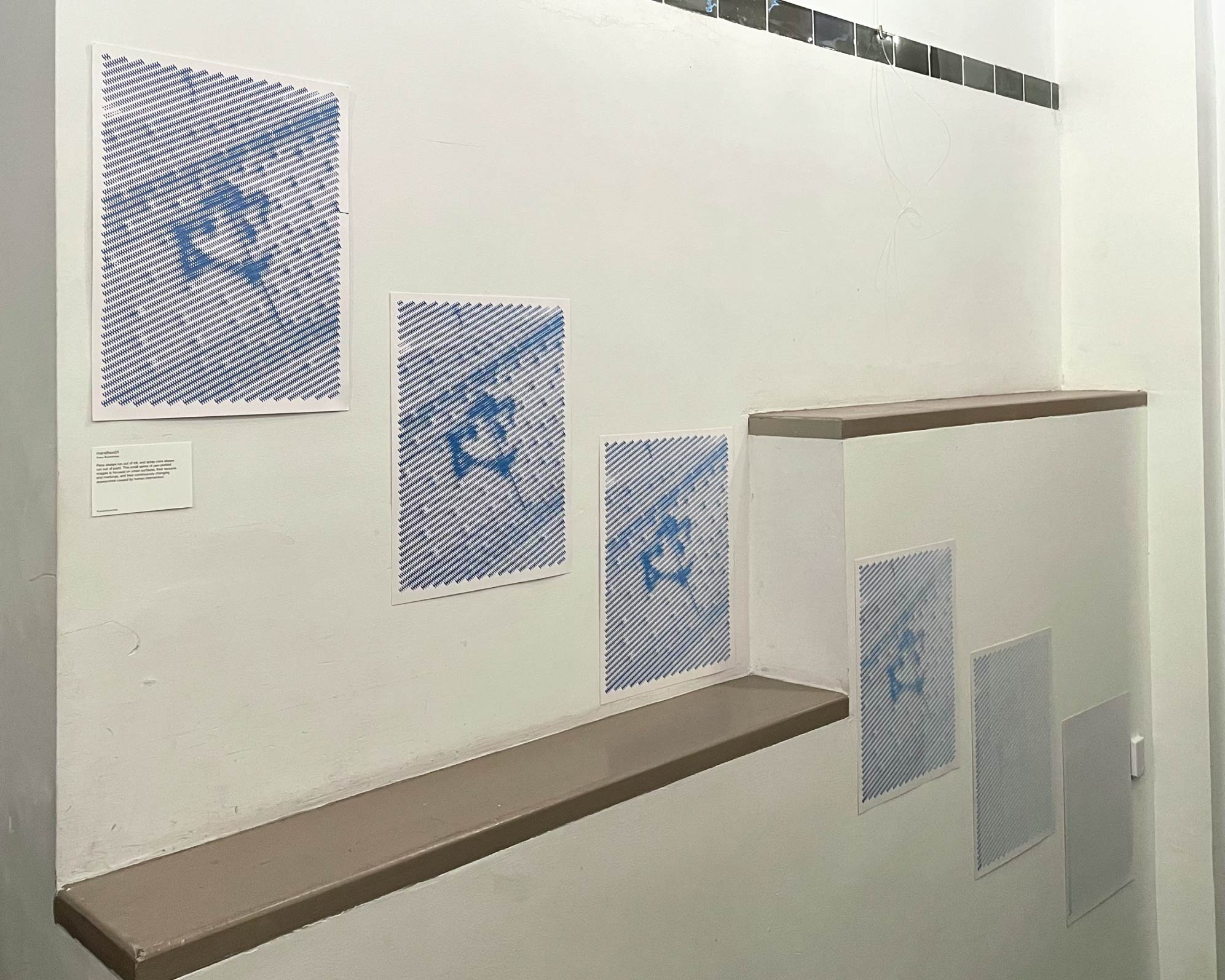
This is a book about internet censorship, based on publicly
available data.
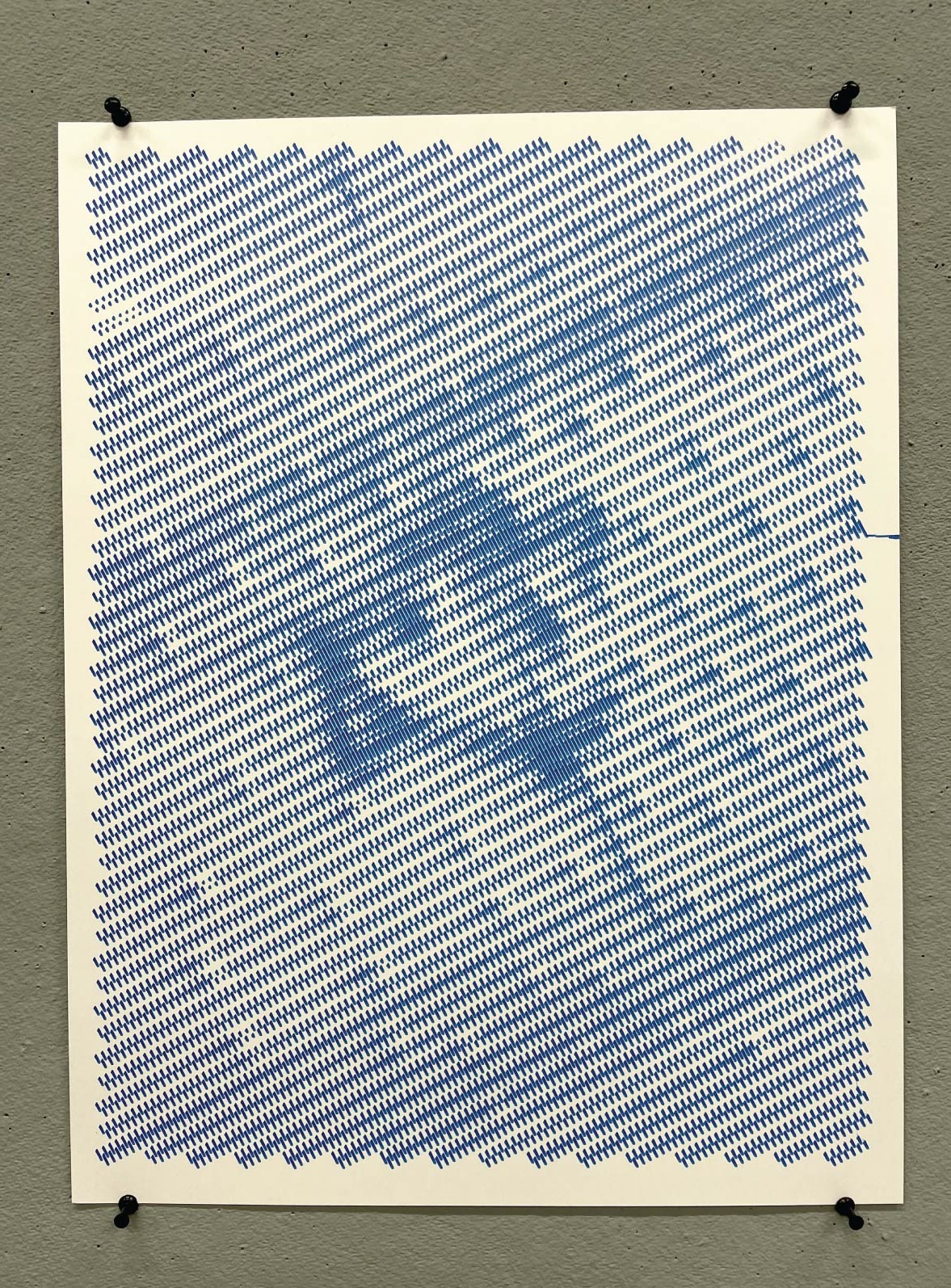
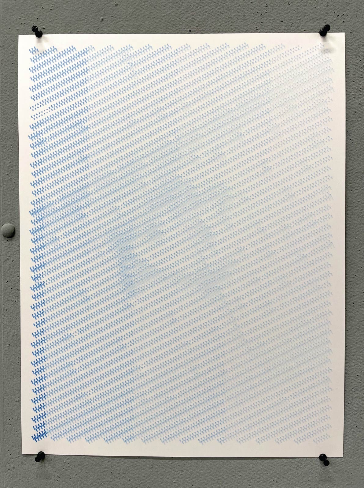
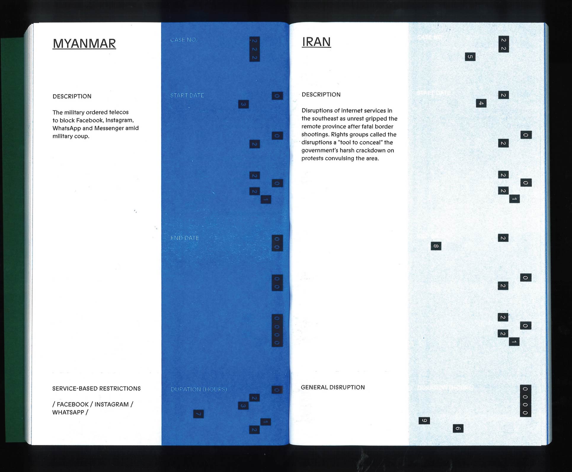
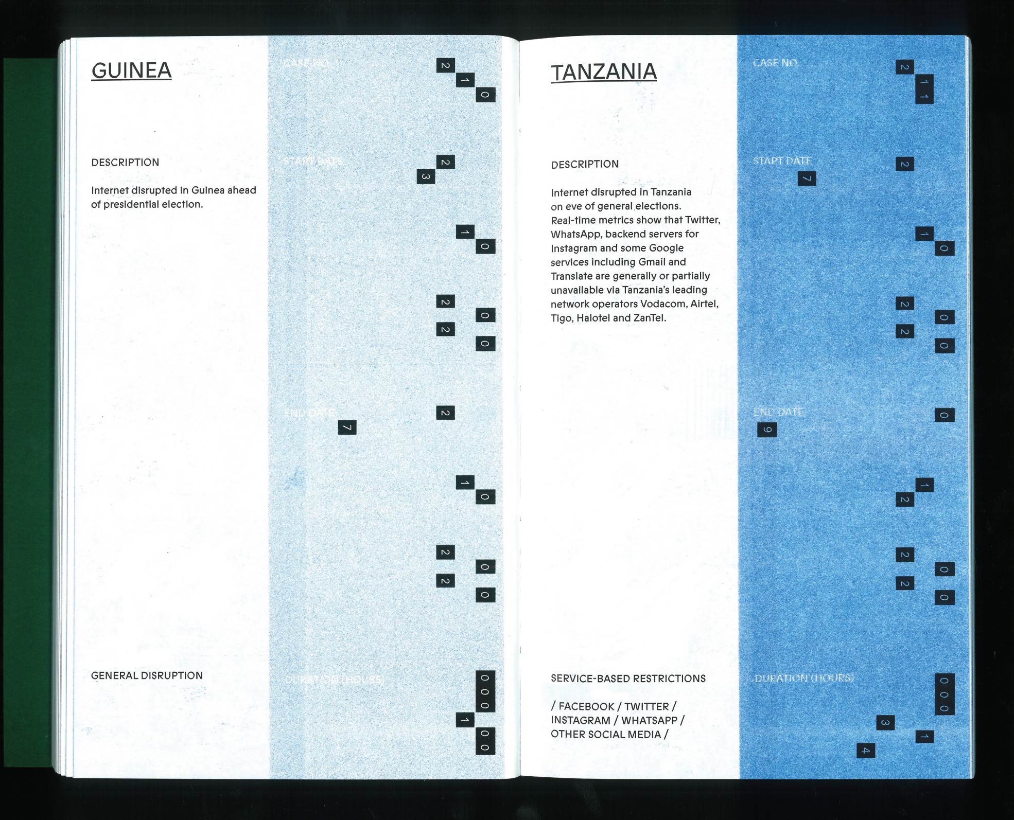
Every page contains a case of a
country blocking one or more websites, or shutting down the whole internet, for a particular period of
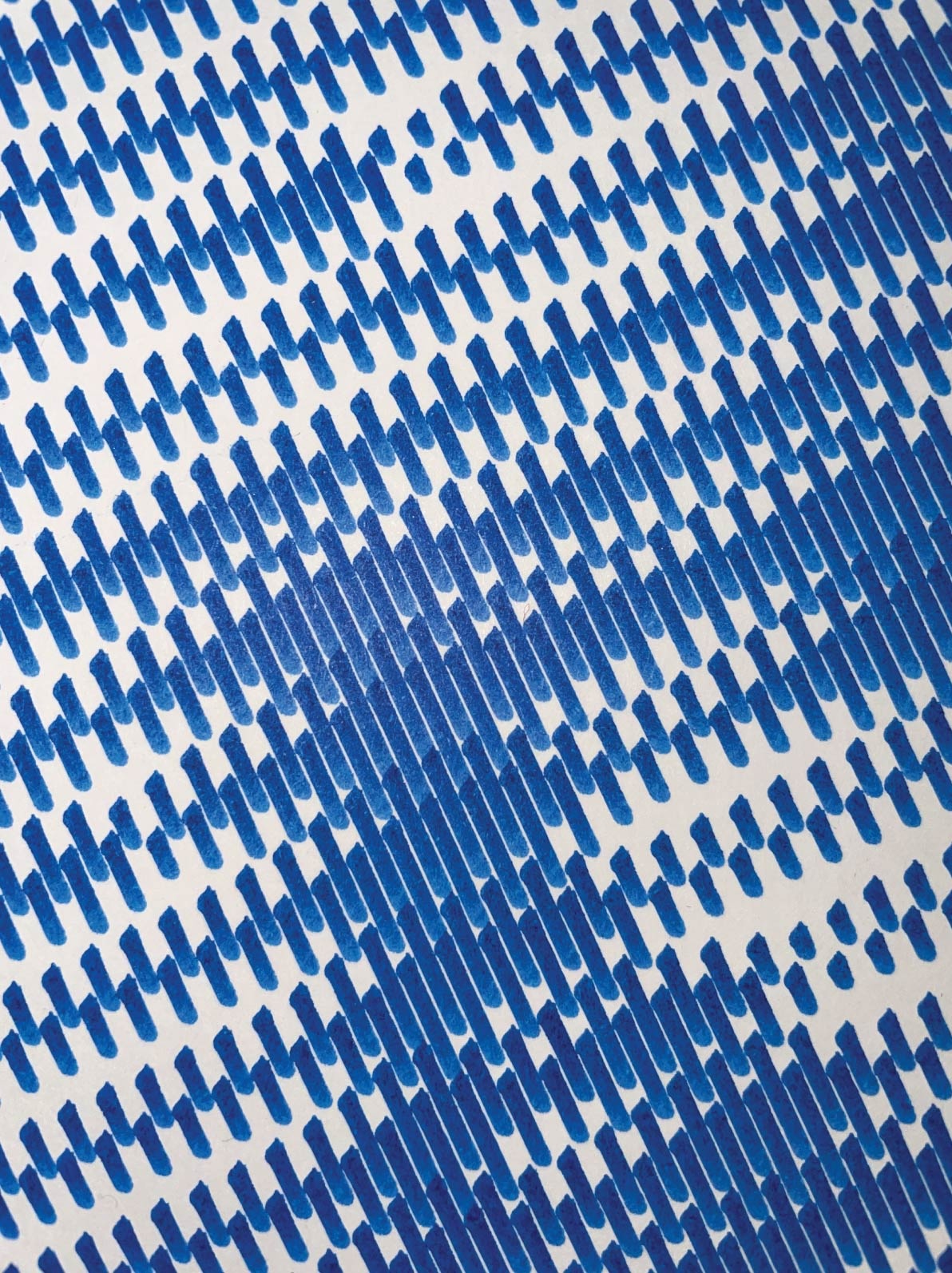
time. The information is formatted
like a punch card, where the numbers form a unique pattern based on the dates and duration of a case. The
colour of the cards is darker in cases where the internet was blocked for longer. The book becomes a
physical
stack
of data, available both online and offline.
In the autumn of 2023 I asked some folks to watch a
film scene - the opening scene from 8½ (1963) - while I recorded their
reaction. The scene is three minutes long, and shows a highly symbolic dream sequence.
I tried out a couple of experimental ways of showing them the scene, in order to find some new
meaning or interpretation of it, eventually having them view it with their eyes closed.
This book consists of the recorded interpretations of the scene, combined with images I found myself, to
create a sense of what the viewers may have imagined, and to peek into the
associative nature of the mind.
A display typeface intended to dazzle the viewer with its
intricate and almost psychedelic linework. It is based on multiple typographic experiments, out of which
came a loose set of rules to create this typeface. To make it, I first created a skeleton
font
digitally, drew the spikes
by hand, and digitalised the result. It was created at my course's
Typography class, and is
featured in Character Club, a
collective publication with typefaces made by students of this class.
With a group of fellow students from Graphic Design Arnhem, I
organise experimental workshops centered around typography. These workshops involve fun and inventive
ways
to create letters, often using unconventional
tools and methods. We want to keep typography as accessible as possible, and anyone inside or outside
the
school can join a workshop. You can follow us on Instagram to see what we’re up
to.
A series of posters made for De Opkamer, a small space
for art and events in Arnhem that, at the moment, is periodically inviting people to paint on their
walls. The posters have very scratchy and odd typography mirroring some of the painting happening on the
wall. The typographical effects were made using a pen plotter in ways it isn’t
meant be used, continuing my long-running experiments with and fascination for this machine.
Letterpress printing is one of the oldest forms of printing, but
it is somewhat obscure today. With the letterpress, a design’s empty space is created by
invisible
elements pushing the printed text into place. I experimented with this rule
and created a
constantly changing pattern using geometric
elements and randomly chosen words. The words form
strange sentences that change meaning depending on the configuration of the words. The pattern is formed
with
friction and compression, which makes it it quite hard to automatically create with a computer.
A 4-colour Risographed test card. It was made in order to test out some ideas, textures and colours for an RISO-based project that is still under construction. It packs a large number of experiments and almost all of the sheet’s space is used. You get extra points if you can spot all of the hidden ‘white rabbits.’
A zine that contains four articles from E-flux Notes, focused on the theme of movement. The zine can be taken apart and folded into multiple paper airplanes, and put together again with an included elastic band. Its typography also plays with the idea of movement by taking a typeface that already has a ‘stretched’ and a ‘compressed’ version, and stretching and compressing it even further where needed or desired.
This photo series shows a lonely window trying to find its
footing somewhere in the world. This window is a replica of the window of my childhood bedroom window,
placed in different locations. The project has a very personal basis: it is an abstract representation of
the feelings of disconnection and placelessness I had when I was a young child. Whether the viewer knows
this or not, I try to get them to feel some empathy for this object.
This is a magazine that contains a selection of almost 80 years’ worth of writing from Vogue magazine about food. From Julia Child and wheat-less wartime recipes to Champagne diets and computer cookbooks, it covers fond memories and interesting historical perspectives, but also some fads and diet ideas that are perhaps best left forgotten. It also has a little art collection that runs through the magazine, showing different depictions of and contexts around food throughout history. Its playful design is inspired both by old cookbooks and by the kitchen table itself.
Pens always run out of ink, and spray cans always run out of
paint. This series of images
is focused on urban surfaces, their textures and markings, and their continuously changing appearance
caused by human intervention. The whole series was pen-plotted with the same brush pen, letting it slowly
run out. Its length was determined by the longevity of the pen.
Website by Jonas Riemersma, 2024
Typefaces: Bianzhidai by Xiaoyuan Gao
and Happy Times by Lucas Le Bihan / Velvetyne